
There are many reasons why the colour selection is important in creating a web design. The most crucial reason would be to create a distinctive design that is easily identifiable with a company, commonly known as Branding.
- Brands often have a set of colours that are chosen to represent the company. The colours are often used uniformly throughout all of the company’s marketing, advertising and media materials. As a company website is commonly a business’ most prominent online presence, it is essential for their branding to remain consistent.
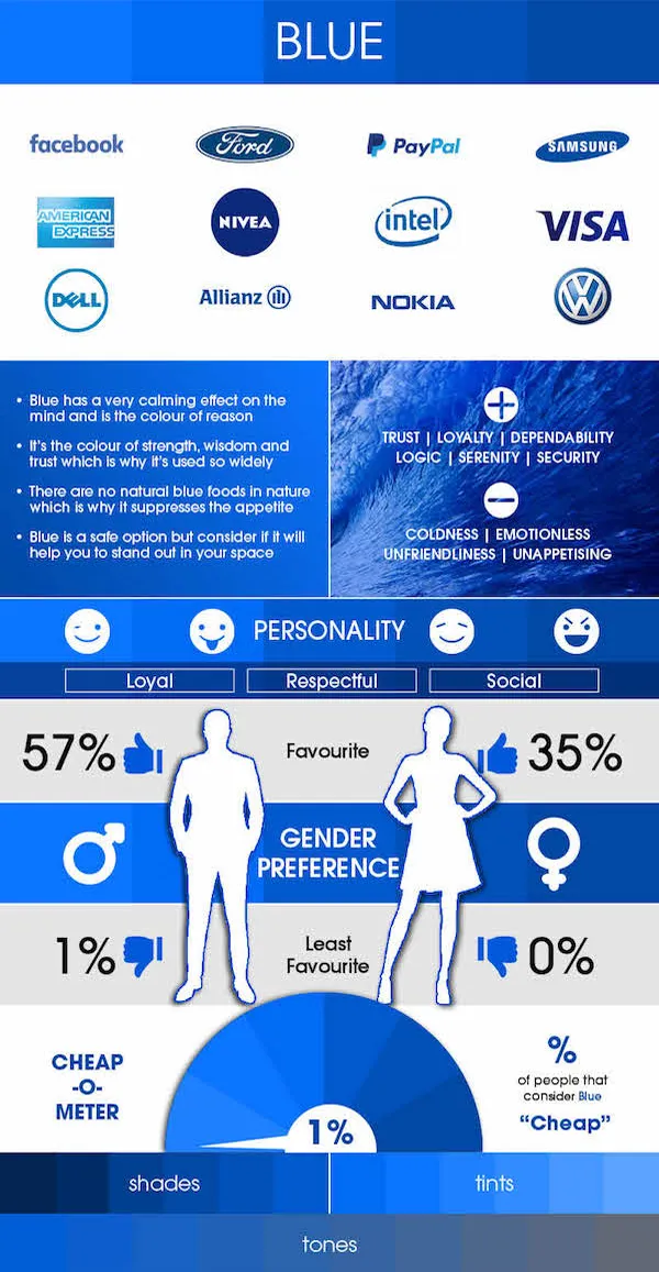
The infographics below from HubSpot shows the impression of brand colours on people:


What Are Colours?
Commonly referred to as “Hues” (Pure Colour), they can be split into 2 basic groups- “Primary Colours” and “Secondary Colours”.

Primary Colours
Red, Blue and Yellow. They are base colours and cannot be obtained by mixing any colours.

Secondary Colours
Green, Orange and Purple. Secondary colours are obtained by mixing 2 primary colours.

“Warm” vs “Cool”
The colours can be further split into 2 groups – “Warm” (Red, Yellow & Orange) and “Cool” (Green, Blue & Purple).

As part of the “Basic Colour Theory”, there is an additional 3rd wheel known as “Tertiary/Intermediate Colours” which are obtained by mixing a primary and secondary colour. Techniques to create colour schemes from the wheels are known as “Colour Harmonies”.
Tints, Tones, Shadows
There are 3 colours that can be applied to the colour wheel which gives the Hues a different appearance, allowing a wider variety of colour choices.

Picture from TheFutur.
Choosing The Right Colours
After deciding on a colour, most brands would need another colour to complement the existing chosen colour. Choosing a suitable colour scheme usually comes with great difficulty. There are a few ways to choose the colour to fit a brand’s colour.
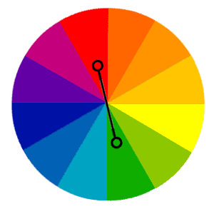
Complementary Colours
The use of colours that are directly opposite of each other on the colour wheel.
Example: Red and Green.
To utilise: Use in vibrant shades to make the colours pop and stand out. However, it is not recommended to be used in bulk or for texts as it might come off too loud.

Analogous Colours
The use of colours that are next to each other on the colour wheels.
Example: Purple, Red and Orange.
To utilise: Use accordingly- 1 main colour, 1 supporting colour and 1 accent colour. As this colour scheme is harmonious, it can be very hard to stand out if there isn’t a contrasting factor.
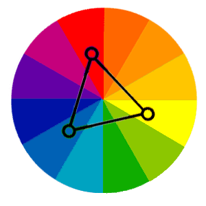
Triad Colours
The use of colours selected from an evenly spaced triangle.
Example: Turquoise, Red and Yellow.
To utilise: Use 1 chosen colour as the main colour and the remaining 2 as accents. It is recommended that the 3 colours should be carefully balanced to be effectively implemented.

Square Colours
The use of colours selected from an evenly spaced Square.
Example: Sapphire, Red, Yellow-Orange and Green.
To utilise: Use 1 chosen colour as the dominant colour. It is recommended to balance the number of warm and cool colours.
We’ll share 2 other methods that are very similar yet different which may prove to be useful.

Split-Complementary Colours
A combination of Complementary and Triad, it is made of 2 colours that are adjacent to the complement of the base. Good for beginners as it offers a strong contrast with less tension.
Example: Green, Red-Orange and Red-Purple.

Rectangle (Tetradic) Colours
A combination of Complementary and Square, it is made of 2 pairs of complementary colours. Works best with a chosen colour as the dominant colour.
Example: Red, Orange, Green and Blue.
How do I apply colours to Web Design then?
There are many areas where applying colours to web design can greatly improve a website and allow consumers to consume the website’s content more efficiently.

- Linked Texts
Although underlining texts allows linked texts to stand out, some consumers would be under the assumption that it is for extra emphasis of a particular word especially when it is located in a large paragraph. Adding colours will allow users to immediately recognise that the texts are linked.

- Providing Feedback
Using colours on interactive elements such as buttons provides a visual feedback for the consumer, informing the user that they are about to or has interacted with the element.
Examples include: button changing colour when a mouse hovers over it, linked text darkening after being clicked to inform users that they have visited the link before.
- Colour Coding Contents
Adding colours to a huge amount of text helps differentiate contents when it gets repetitive using Bold, Italics and Underline, making it appealing to the readers. The use of indentation and checklist would also further increase the effectiveness.
- Spacing
Spacing out and separating content might sometimes ruin the aesthetic of the content (example: using a line) or at worse, confuse readers. Using colours helps to space out and separate content subtly and effectively. Example: Using a grey background gives the impression that the wide spacing is not that empty. Note that the intensity of the grey background is just for visual purposes.
Play around and have fun creating a good colour combination for your website! The beauty of this is that the more you do it, the better you get at choosing the ideal colour scheme for your website. So feel free to tweak things, you’ll get to know what works together and what doesn’t.